The term to 'monopolise' means to have control fully and exclusively.
With this term in mind, we utilised it's definition to create an ironic nature around the idea of the money theme. By using 'Monopoly' money, we referenced the term 'monopolisation'. It is then ironic in the sense that the characters within our video who are supposed to be representing fans of the ska genre, both of the present time and also potentially the time when ska music was at it's peak, such as the skinhead ska/punk characters from This is England '86, who considering their current economic situation were far from 'in control' of the situation. The economic depression under that government of Margaret Thatcher had caused mass unemployment and so the working class people of the time, including the ska/punk fans such as the characters from This is England, would not have been able to have a direct impact. Because of this, our use of monopoly money ironically highlights their lack of control, considering the term 'monopolising' itself means the direct opposite.
As well as this ironic underlaying meaning to our use of the money, there is also a more direct meaning. The fact that the money is from a board game, monopoly, can also be directly related to our female protagonist. It is heavily implied within the video that she is literally 'playing a game' in order to gain money for herself, as well as being a metaphor for the economic climate and money-grabbing banker situation. Being the strong female character she is, she is in complete control of the game she is playing, which of course is again linked to the term monopolisation so rather than there being an ironic meaning, the use of monopoly money is also presenting the fact that the female protagonist is in complete control of the supposed male characters that she is taking financial gain from.
3. Men’s magazines construct the language (discourse) and themes (narratives) of masculinity which readers then use in their own way to construct their own sense of masculine identity.
Although many mainstream men’s magazines such as Loaded, which launched in 1994, aim to target their audience to gain their attention through stereotypical views of ‘lad’ interests such as soft porn and cars, other magazines such as FHM began to emerge, promoting themselves as men’s lifestyle magazines, which were at the time of launch (1994) unheard of in the masculine magazine industry. However it soon became clear that men in general were in fact interested in a less macho lifestyle magazine as sales of FHM prevailed over those of Loaded for the first time in 1996. This new approach of lifestyle magazine enabled the male readers to read about issues that interested them (and this may also certainly include women and cars as well!), and could pick and choose different aspects of the magazine that took their interest in order to in a sense construct their own identity, as opposed to being force-fed media of the typical ‘lad’ culture.
Another example of this was with the new form of online men’s consumer magazines; Mansized (www.mansized.co.uk). It was described as being ‘aimed at men who think with their minds’ which implies that any other typical ‘lad mags’ are in fact churning out the same images of half-dressed women with the aim of appealing to the typical working class male who craves the same thing over and over, without having to think about it.
4. Narratives of masculinity are the main background foundations that would fit the characteristics of a typical male figure. For example, the main narratives that are highlighted by Gauntlett in the piece are that men like to look at women, but don’t know too much about them. They are essentially the underlying basis’ to which a stereotypical male, who is a reader of lads mags, would live by.
5. There have always been two distinctive types of men’s magazines, the typical ‘lads mag’ variety such as Loaded, and the magazines for ‘men who have money’ such as GQ. The more ‘laddish’ variety are aimed at the more working class male population who enjoy the entertainment of half-dressed women, whereas GQ is targeted more at a higher class of male who is interested in expensive fashions, which can often be seen as pretentious. In the very late 20th century, men’s magazines were on a whole, force feeding the male population with the same images and themes every month to which they had become accustomed. This essentially created a set identity for the readers. In order to sustain their success in the male market, they have to ensure that they conform to this trend, as to keep the audience happy and interested (which can be linked to Kress! How audiences find comfort in the texts and media that they find familiar). However, from the emergence of the millennium, men’s magazines began to encourage the free creation of one’s own identity. One example of this is how FHM has changed from an initially unsuccessful fashion magazine, into a highly successful men’s lifestyle magazine. Other examples include the release of Mansize (aforementioned), and how publications such as Men’s Health, which encourages males to take an interest in their own health rather than gorping at falsely glamorised icons. This new era of magazine has become increasingly popular as the male audience has become more inquisitive about it’s own identity. Rather than all men’s magazines churning out the same images of cars and women, more men’s lifestyle magazines have begun to emerge as the social expectation of the male gender has broadened and moved away from the macho, ‘laddish’ view.
Having completed my music video, I then aimed to create my print productions with the video in mind. It is of vital importance that there is an extent of continuity from the video when producing the print productions, as it needs to be made clear that one is directly linked to the other as to form an emphasised brand style; in our case Two-Tone Ska and Ska/Punk.
I have used a number of techniques in order to create this specific brand style, and to for a solid link between my video and digipak. One way in which I did this was by using screen shots from my initial video footage to use in the panels of my digipak. When shooting our initial footage for the video we dressed in clothing relevant to the genre, and for example performed the ‘Madness Walk’ and ‘skanked’ around various areas of the city to be used in our concept-based montage. One specific shot was of us all dressed in our Dr Martens boots, suspenders and Fred Perry shirts (and Jack in his suite and trilby) where we had attempted the Madness Walk aforementioned, and discussed in greater depth in the previous question. I used a shot of us in action by taking a print screen of our video and saving it as a Jpeg file. I then opened it with Adobe Photoshop and edited the original picture (using such effects as increased saturation and the text tool) to be used as the front panel for my digipak. I used this as I felt it to be wholly effective in both establishing the band members and the genre, as well as being a direct link to the music video itself. If the audience has viewed the video before, and then gone out to a music store and seen the front panel of the digipak on a shelf, they will instantly recognise it as being the E.P. for our band as it is a direct picture from the video they have already seen; it is colourful and eye-catching, and instantly recognisable to the audience who have viewed the video. It is appealing to our audience and a form of brand style that can be easily related to by the fan base, through our use of genre conventions (i.e. costume and quirkiness). This is one way in which my print productions are heavily linked to our video. These two images show the initial image we took whilst on our initial shoot, and the completed digipak front panel, showing the progression from raw image to completed production through increased saturation, cropping, use of text tool and border. These changes have been effective in making the image more appealing to the audience by making it more eye-catching through the increased saturation, and more relevant to the two-tone aspect of ska from the use of the border, whilst keeping the continuity of the genre in the video production through the use of the exact image used in the video.
This idea of my target audience feeling a sense of familiarity can be heavily linked to Andrew Goodwin and his theory about recurring motifs. This is essentially when an artist begins to create a brand style for themselves, a particular image that they either intentionally attempt to, or unintentionally achieve which is then more widely recognised and then associated with that artist. For example, throughout our music video, our actors are dressed in typical ska costume. This same costume is then used in our image on the front panel of my digipak with the aim of creating continuity. Because this same costume features so prominently, the audience begin to associate this type of costume with our band.
Another media theorist that can be mentioned is again, Gunther Kress, whose theory about genre is explained in more detail in the previous question. I have used a chequered border around the front panel of my digipak, as it is a generic convention of the two-tone ska genre. Because this will be instantly familiar with audiences whose preferences include this sub-genre, they will conform in the product with the aim of feeling a sense of inclusion in the two-tone ska following. This is my reasoning behind including the border on my front panel, and emphasises the coherence of my digipak.
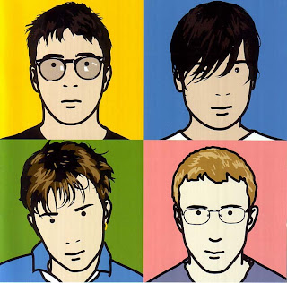
The inspiration for my second panel was taken from the artwork of Blur’s album ‘The Best of Blur’ and I felt it a simple yet effective way of establishing the band members. I have taken a shot of each of the four acting members of the band (including myself) and arranged them into quartered sections of the panel, much like with Blur’s album. I have then edited the ‘threshold’ of the image to make the actors’ faces appear black or white upon the contrasting background, as shown below. My reasoning for doing this can again be linked to Kress’ theory of genre. Because my target audience are highly likely to be fans of the two-tone sub genre, this photoshopping technique is likely to be appealing to them, as contrasting black and white in very simple uses and patterns is very common of two-tone, and when fans see this design, connotations of two-tone will be instantly instigated and will be drawn towards it due to a will for social inclusion. I also chose to make the actors look at each other across the various sections to add an element of fun and quirkiness, to be in-keeping with the fun attitude of ska. Although this is a different approach to that of the ska/punk element of our productions, our band is predominantly two-tone so this use of black on white is wholly appropriate.
My third panel is a play on the whole idea of the protagonist of our video being seen as a money-grabber. A recurring theme throughout our video is the use of monopoly money. This is to reference the economic state at both the current time, and the era during which ska music was at it’s peak (80’s), and highlight the attitude towards it given by the ska/punk audience of that era (such as the characters from ‘This is England ’86’). It emphasises that it is not held in high regard, and that money isn’t everything; as if it is all a political, financial muddle, much like a messy game of monopoly. We have centered Izzy amongst a backdrop of monopoly money, on which I have used an effect to make it look as though it is spinning. This gives connotations of the money grabbing woman being in control as the image of her is steady and crisp, whereas in contrast her surroundings are a blurry motion to connote chaos. It is to present that idea that the lead female character is completely in control of the financial chaos being undergone by the British public around her, because of her money-grabbing nature. The bright colours are in-keeping with the fun element of ska music which has become generic of the genre since it’s popularity has grown. A similar theme to this has been used in the creation of my poster, which has used the same image to present the same idea about the money-grabbing female protagonist. This emphasises the continuity between my productions because of the visual link between them, and has helped towards creating a coherent promotional package which has an intentionally created brand style (being that of the multiple uses of monopoly money, presentation of the female protagonist, costume and uses of both bright saturated colours also with elements of black on white etc.) that is appealing to my target audience.
My final panel of the digipak is in-keeping with the urban style of the ska genre as it is an image that I have taken outside of a local shop, and have manipulated to insert track names from the E.P. to appear as graffiti on the wall. It is also keeping the continuity from the other products in the sense that it is heavily focused around the country’s financial situation, be that both from the era when ska was at it’s peak popularity, and the contemporary situation. The use of a news board, featuring a headline regarding ‘bankers’, is intended to promote the financial background of my productions. Throughout our music video the actors are shown in urban locations, and mixed in with the concept-based montage of monopoly money, relates heavily to this final back panel of my print productions, via both the urban and financial topics. Like in each of the other panels, and music video, I have manipulated the original image with effects to increase both the saturation and contrast to make it appear more bold and fun to be fitting of the ska genre.
Our music video is very much typical of the ska genre and the aspects of it that we aimed to achieve, however overall greatly challenges conventions of the role of women within society. The most prominent media text used within all of the research, planning and shooting of our production is Shane Meadows’ ‘This is England’. This is greatly emphasised through the costume of the cast in our video. We have taken ideas for the costume of our cast predominantly from TIE (This is England). We have used Dr Martens boots, Fred Perry shirts, trilby hats, black slim fit suits and suspenders, all of which are iconic of the genre and feature in TIE. For example, these are the suspenders worn by me when acting as a band member in the video, and also there is a shot of Shaun, the protagonist from both TIE and TIE ’86 (the follow-up TV series) from which we got our costume inspiration. Although we had previously established that our song is more fitting of the two-tone ska sub-genre, we still felt it highly appropriate to cross reference texts of the more ska/punk sub-genre such as TIE when regarding aspects such as costume in our video. There are also large amounts two-tone elements within it such as the suit worn by Jack (actor), trilbies, and badges and glasses worn by both Jack and Izzy (actress), which are far more conventional of this sub-genre.
Another way in which we utilised aspects from similar texts of the ska genre is in the variety of shots we used. Our opening shot is of Izzy playing the protagonist female ‘money grabber’ and lead singer of the band, where we used an over-shoulder shot of her getting ready in the mirror. This inspiration was taken from a similar shot from TIE. There is also a brief shot of the same type later on in the video where Harley (actor playing band’s drummer) is seen getting ready in the mirror in the same fashion. In the case of the shots regarding Izzy, she is shown putting on lipstick which emphasises her role within the video as being very much typical of the social expectations of women, making herself look glamorous. This is also in in-keeping with the theme of the song – ‘Moneygrabber’ in which it suggests that the female character is a glamorous figure who manipulates men to get her hands on their money. However in contrast, this idea of a woman having power over the male figures is not fitting of the female stereotype, so this is an example of how our video challenges the conventions of the roles of women within society.
We also heavily referenced other bands of the genre within our video to make the production more fitting of the genre, and to make it more appealing to our target audience. The band we focused most prominently on are ‘Madness’. Madness are a British pop/ska band from Camden Town in London, who formed in 1976. They were the pioneers of a particular style of dance/walk called the Madness Walk (shown in this picture). For our own production to become more appealing to our band’s target audience, and as Madness are a band so heavily linked with our own to use as an intertextual reference, we attempted to recreate this style of walking, which is typical of Madness’ fun and quirky approach to ska. In terms of sub-genres, Madness were very much of the two-tone wave and were typically seen performing in smart black and white suits and Suggs’ (lead singer) iconic aviator-style glasses. The fact that we have dressed our actor Jack in a similar style works well towards recreating their image and emphasises how influential a band they were to the planning and production of our video. This is an example of how we have utilised aspects of real media products in our own production.
The reason behind us having referenced Madness so strongly throughout our video can be linked to the media theorist, Gunther Kress. In 1988 he defined a genre as being ‘a kind of text that derives it’s form from the structure of a frequently repeated social occasion, with it’s characteristic participants and their purposes’. This basically means that when watching certain media productions that have elements of similarity to other texts they are familiar with, audiences feel a sense of belonging to a specific group. For example in our own video, when we dress our actors in clothing typical of the ska genre, and they view the actors performing the ‘Madness Walk’, they recognise these as having been in similar media productions so feel a sense of familiarity and comfort, so feel a part of the ska social grouping. Therefore our music video has the aim of making the audience feel a sense of collective identity.
Again looking at media theorists, Andrew Goodwin also played a large role in the planning of our own production. Goodwin’s theory states that successful music videos must demonstrate genre characteristics. Our own video evidently does this in terms of costume and shot types etc. as explained in previous paragraphs of the question. Because our band are of the ska genre, our video is not likely to feature a dance routine as would be used by a girl or boy band, as it would be completely ill-fitting of the genre and would not appeal to our target audience. Instead we have made a quirky montage of both performance and concept-based images that is far more typical of the genre. He also stated that there should be a relationship between lyrics and visuals in the video. This is greatly appropriate to our own production as when the lyrics are referencing the ‘money-grabbing woman’ we ensured that Izzy is on screen playing the part of the money-grabber, or shots of money are in focus as this is strongly appropriate to the lyrics. Doing this has made our production far more successful than showing shots or beaches in Miami or swimming pools, as this would be completely inappropriate of the ska genre.
Our band, The Skanx, fit mainly into the 'two tone' context of ska, which was initially created in the UK the 1970's and uses elements of ska, ska punk and reggae dub to fuse together a brand new sub genre. Out of the similar artists I have researched in the planning of our video, The Specials and Madness are the bands that fit most into the two tone ska sub genre, so i can safely say that The Skanx are most closely related to The Specials and Madness in terms of genre, rather than say [Spunge] who are of the later ska revival genre of the 90's called 'third wave ska', being a different scene to the two tone ska scene. This two tone ska association is backed up by some of the art used in their videos, which black and white simple checked design is heavily linked with the two tone ska scene, for example this band logo. Because of the fact that two-tone initially came about in the 1970’s, our target audience are not likely to be as youthful as the audiences of third-wave or ska/punk. We aim to appeal more so to the male half of the audience, having portrayed the main character in our video as a glamorous, money-grabbing woman, as this may not be as appreciated by a female audience. In conclusion, our target audience are likely to be males of a thirty to forty year age, much like the audience of our most prominently focused-on similar band, Madness.
Throughout the planning and shooting stages of the production of our music video, we took inspiration for a range of aspects including shot types, action and costume from a number of different existing media products. One of our largest influences throughout the planning of our video was the band 'Madness'. Prior to the shooting of our own production, we did a variety of research into similar bands and their own video, which brought us to watch Madness' video for their hit 'One Step Beyond, discussed in greater detail in a previous post. This was the first time in which we as a group had come across a type of dance performed by the band called the 'Madness Walk'. We saw this as a perfect opportunity to increase the appeal of our own video, as well as take the opportunity to have a prominent reference within it. The walk is featured at the beginning of the video as shown below. It was a quirky and interesting way in which to referencesimilar artists,not to mention the fun shooting it!
Another of the references we used, and almost certainly our main reference, was both the film and tv series of 'This is England/'86). To really capture the urban feel of the genre, we wanted to include a number of shots of urban locations and scenes in our concept-based montage and took inspiration from This is England, in particular the scene where Shaun is seen walking along the wall when terraced housing is shown in the background. We focussed on this particular shot to influence two of the ideas from within our own video. Firstly we used the fact that Shaun was walking along the wall, and saw this to be a potential reference. We then took this idea as being from an existing media product and attempted a similar shot ourselves, shown near the beginning of the video (around ) where our acting band are shown walking across the pole in fast motion. We then added a reverse of the same shot directly after (as you can see from watching the video at the stated time) as this added an element of fun and quirkiness, hence conforming to the fun style of the ska genre. The movement of our actors (the way in which they are walking across the pole)can also be linked to the Madness Walk, previously mentioned, as we combined the idea of this scene from This is England with referencing an existing band of the same genre. (image blurred as screenshot from video).
We also imitated this shot in a different way, when focussing on the background setting of the terraced housing rather than the action of Shaun walking. We faced the camera out of a moving car window whilst driving past terraced houses. We used this footage to good effect towards the end of our video (around 2:10) and layered it over the top of other footage we had gathered showing the band 'skanking' (ska dance). This was in order to increase the appeal of the shot by making it more interesting, whilst further boosting it's reasoning to be included in the video by conforming to the conventions of the genre, by featuring the dancing ska-dressed actors on the second layer.
A large theme throughout our video is the use of monopoly money. We thought this to be a very relevant and interesting idea, considering the current economic climate as well as the economic situation at the time when ska/punk music was at it's peak popularity (1980's) as presented in the This is England '86 drama which we focussed heavily on, in which a large theme is that of unemployment due to the government at the time. We felt that by using monopoly money rather than actual money (as well as the fact that none of us have that much cash!), we were presenting the attitude of the characters from This is England regarding the importance of money, highlighting the fact that they saw the entire economic situation as a 'joke', as if it could be a game like monpopoly. For this reason we felt it highly appropriate to use the toy money.
Another reason for our use of monopoly money was to present our video's protagonist, the money-grabbing female. Because of the fact that monopoly is literally a board game, our utilisation of it presents the fact that the money-grabbing female is playing a game, as if she knows which 'moves' to make in order to gain money. It also implies that she is completely in control of this game she is playing, which can be linked to the term 'monopolisation' (discussed in detail in a self-titled post) meaning to be in complete control.
There were a range of shots in our video in which the main focus was around the monopoly money. For example the shot where the female hand is shown grabbing the money from the table. This is a very literal way in which we linked our footage to the title of our video. We also used a low angle shot of one of the male acting band members dropping money onto the camera. This presented how money is being taken from the average British citizen by the money-grabbing bankers as in the shot, the money is falling out of his grasp. It also highlights the idea that the money-grabbing female could be making financial gain from being the stereotypical money-grabber that she is represented as being, by taking money from the male characters. This particular shot was inspired by us watching a music video of a very different genre. From watching the video for 'Oh No' by the indie pop sensation 'Marina and the Diamonds' we discovered a variety of shots where she as the female singer is shown literally grabbing money and presenting herself as the stereotypical money-grabber. It was this particular shot, shown below, where she is shown picking up money viewed from a low angle through a pane of glass, which inspired our shot of the male character in our own video dropping the money onto the camera. This can be used as a direct intertextual reference for our shot, and the fact that we also played the shot backwards directly after likens it even more to the specific shot from the Marina and the Diamonds video where she is picking it up rather than dropping it.
Low angle shot from Marina and the Diamonds video, influenced shot in our own video, shown above.
Other shots involving the use of monopoly money within our production are the stop-motion animations which feature twice within our video. Prior to the shooting of our production stop-motion was an idea that we were considering greatly, and had unanimously agreed that the inclusion of at least a small section of it would increase the appeal of our production. The existing media product that further inspired our idea and pushed us to follow it through by showing us how effective it could be was a video called 'Monopoly Madness', which we came across by searching 'monopoly stop-motion' into Youtube (described in greater detail in a previous post). The video gave examples of ways in which we could use stop motion in a fun and relevant way (relevant as using the money, which relates strongly to our whole theme) so conforming to the fun and quirky concept of the ska genre. The fact that for the stop motion to be effective the editing has to be fast-paced is also a generic element of ska; the fast pace of editing is fitting to the upbeat pace of the track and conforms to the fast nature of typical ska music. Below is an example of the stop motion we used in our final video, using the money to spell out the word 'MONEYGRABBER'.


 Another way in which we utilised aspects from similar texts of the ska genre is in the variety of shots we used. Our opening shot is of Izzy playing the protagonist female ‘money grabber’ and lead singer of the band, where we used an over-shoulder shot of her getting ready in the mirror. This inspiration was taken from a similar shot from TIE. There is also a brief shot of the same type later on in the video where Harley (actor playing band’s drummer) is seen getting ready in the mirror in the same fashion. In the case of the shots regarding Izzy, she is shown putting on lipstick which emphasises her role within the video as being very much typical of the social expectations of women, making herself look glamorous. This is also in in-keeping with the theme of the song – ‘Moneygrabber’ in which it suggests that the female character is a glamorous figure who manipulates men to get her hands on their money. However in contrast, this idea of a woman having power over the male figures is not fitting of the female stereotype, so this is an example of how our video challenges the conventions of the roles of women within society.
 The reason behind us having referenced Madness so strongly throughout our video can be linked to the media theorist, Gunther Kress. In 1988 he defined a genre as being ‘a kind of text that derives it’s form from the structure of a frequently repeated social occasion, with it’s characteristic participants and their purposes’. This basically means that when watching certain media productions that have elements of similarity to other texts they are familiar with, audiences feel a sense of belonging to a specific group. For example in our own video, when we dress our actors in clothing typical of the ska genre, and they view the actors performing the ‘Madness Walk’, they recognise these as having been in similar media productions so feel a sense of familiarity and comfort, so feel a part of the ska social grouping. Therefore our music video has the aim of making the audience feel a sense of collective identity.

 We focussed on this particular shot to influence two of the ideas from within our own video. Firstly we used the fact that Shaun was walking along the wall, and saw this to be a potential reference. We then took this idea as being from an existing media product and attempted a similar shot ourselves, shown near the beginning of the video (around ) where our acting band are shown walking across the pole in fast motion. We then added a reverse of the same shot directly after (as you can see from watching the video at the stated time) as this added an element of fun and quirkiness, hence conforming to the fun style of the ska genre. The movement of our actors (the way in which they are walking across the pole)can also be linked to the Madness Walk, previously mentioned, as we combined the idea of this scene from This is England with referencing an existing band of the same genre. (image blurred as screenshot from video).


