I have used a number of techniques in order to create this specific brand style, and to for a solid link between my video and digipak. One way in which I did this was by using screen shots from my initial video footage to use in the panels of my digipak. When shooting our initial footage for the video we dressed in clothing relevant to the genre, and for example performed the ‘Madness Walk’ and ‘skanked’ around various areas of the city to be used in our concept-based montage. One specific shot was of us all dressed in our Dr Martens boots, suspenders and Fred Perry shirts (and Jack in his suite and trilby) where we had attempted the Madness Walk aforementioned, and discussed in greater depth in the previous question. I used a shot of us in action by taking a print screen of our video and saving it as a Jpeg file. I then opened it with Adobe Photoshop and edited the original picture (using such effects as increased saturation and the text tool) to be used as the front panel for my digipak. I used this as I felt it to be wholly effective in both establishing the band members and the genre, as well as being a direct link to the music video itself. If the audience has viewed the video before, and then gone out to a music store and seen the front panel of the digipak on a shelf, they will instantly recognise it as being the E.P. for our band as it is a direct picture from the video they have already seen; it is colourful and eye-catching, and instantly recognisable to the audience who have viewed the video. It is appealing to our audience and a form of brand style that can be easily related to by the fan base, through our use of genre conventions (i.e. costume and quirkiness). This is one way in which my print productions are heavily linked to our video. These two images show the initial image we took whilst on our initial shoot, and the completed digipak front panel, showing the progression from raw image to completed production through increased saturation, cropping, use of text tool and border. These changes have been effective in making the image more appealing to the audience by making it more eye-catching through the increased saturation, and more relevant to the two-tone aspect of ska from the use of the border, whilst keeping the continuity of the genre in the video production through the use of the exact image used in the video.


Another media theorist that can be mentioned is again, Gunther Kress, whose theory about genre is explained in more detail in the previous question. I have used a chequered border around the front panel of my digipak, as it is a generic convention of the two-tone ska genre. Because this will be instantly familiar with audiences whose preferences include this sub-genre, they will conform in the product with the aim of feeling a sense of inclusion in the two-tone ska following. This is my reasoning behind including the border on my front panel, and emphasises the coherence of my digipak.
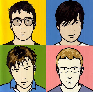
The inspiration for my second panel was taken from the artwork of Blur’s album ‘The Best of Blur’ and I felt it a simple yet effective way of establishing the band members. I have taken a shot of each of the four acting members of the band (including myself) and arranged them into quartered sections of the panel, much like with Blur’s album. I have then edited the ‘threshold’ of the image to make the actors’ faces appear black or white upon the contrasting background, as shown below. My reasoning for doing this can again be linked to Kress’ theory of genre. Because my target audience are highly likely to be fans of the two-tone sub genre, this photoshopping technique is likely to be appealing to them, as contrasting black and white in very simple uses and patterns is very common of two-tone, and when fans see this design, connotations of two-tone will be instantly instigated and will be drawn towards it due to a will for social inclusion. I also chose to make the actors look at each other across the various sections to add an element of fun and quirkiness, to be in-keeping with the fun attitude of ska. Although this is a different approach to that of the ska/punk element of our productions, our band is predominantly two-tone so this use of black on white is wholly appropriate.
 My third panel is a play on the whole idea of the protagonist of our video being seen as a money-grabber. A recurring theme throughout our video is the use of monopoly money. This is to reference the economic state at both the current time, and the era during which ska music was at it’s peak (80’s), and highlight the attitude towards it given by the ska/punk audience of that era (such as the characters from ‘This is England ’86’). It emphasises that it is not held in high regard, and that money isn’t everything; as if it is all a political, financial muddle, much like a messy game of monopoly. We have centered Izzy amongst a backdrop of monopoly money, on which I have used an effect to make it look as though it is spinning. This gives connotations of the money grabbing woman being in control as the image of her is steady and crisp, whereas in contrast her surroundings are a blurry motion to connote chaos. It is to present that idea that the lead female character is completely in control of the financial chaos being undergone by the British public around her, because of her money-grabbing nature. The bright colours are in-keeping with the fun element of ska music which has become generic of the genre since it’s popularity has grown. A similar theme to this has been used in the creation of my poster, which has used the same image to present the same idea about the money-grabbing female protagonist. This emphasises the continuity between my productions because of the visual link between them, and has helped towards creating a coherent promotional package which has an intentionally created brand style (being that of the multiple uses of monopoly money, presentation of the female protagonist, costume and uses of both bright saturated colours also with elements of black on white etc.) that is appealing to my target audience.

My final panel of the digipak is in-keeping with the urban style of the ska genre as it is an image that I have taken outside of a local shop, and have manipulated to insert track names from the E.P. to appear as graffiti on the wall. It is also keeping the continuity from the other products in the sense that it is heavily focused around the country’s financial situation, be that both from the era when ska was at it’s peak popularity, and the contemporary situation. The use of a news board, featuring a headline regarding ‘bankers’, is intended to promote the financial background of my productions. Throughout our music video the actors are shown in urban locations, and mixed in with the concept-based montage of monopoly money, relates heavily to this final back panel of my print productions, via both the urban and financial topics. Like in each of the other panels, and music video, I have manipulated the original image with effects to increase both the saturation and contrast to make it appear more bold and fun to be fitting of the ska genre.

I'll assess your draft and give you feedback. I've taken a hard copy. Thanks for all your hard work.
ReplyDelete