Sunday 10 April 2011

Final Evaluation: Q4 - How did you use media technologies in the construction and research, planning and evaluation stages?

One of the most vital media technologies that I used during the construction process of the music video was the digital video camera. For obvious reasons, this was a key technology throughout the entire shooting phase. As well as the capturing of the footage to be used for the final edit, we could also use the camera to experiment with different shots. We had previously learned from the preliminary task last year that different shot types have different effects on the audience, for example low angle shots of a subject make them appear powerful and menacing such as this shot below. We were able to combine this knowledge with the technology at our disposal by experimenting with various shots to gain desired effects. We discovered that close-up shots of our main actor both established her as the lead singer as well as conforming to conventions of the genre and music style, as combined with a handheld camera and the action shots of the band ‘skanking’ (a type of dance often performed to ska music) made the shot type appear fun and quirky, much like our soundtrack. We could also use the pause, rewind and play features on the video camera in order to review our raw footage whilst out on shoots. This feature enabled us to save great deals of time when constructing the video, as the only other method of viewing the footage would have been to link it up to a computer. Because we could view the footage we had just taken when out on a shoot, this gave us the opportunity to immediately review the different shot types and evaluate their effectiveness. We could then make a group decision as to whether it was suitable, or whether it needed to be re-shot, attempted from a different position with different actors, or ignored completely when undertaking the editing process (these all being just a few examples), such as the initial shot we took of the lead singer getting ready in the mirror; upon reviewing the footage it became apparent that the camera was visible in the mirror in the background, thus we knew we had to re-shoot. Because of this, this feature of the camera enabled our progression greatly.

Having uploaded this raw footage onto the computer via a firewire cable, we were then able to open this footage on a programme called ‘Adobe Premiere Elements’. This editing software was a key element in the production of our entire video. Firstly, we were again able to review the entirety of the footage we had taken on a larger screen, in better quality, as opposed to the small screen on the camera we had used whilst on the shoot. This allowed us to make an informed decision on the quality of the shot, and could notice any small faults with the shot or quality of the picture that were not previously apparent. For example, whilst shooting some of our cast ‘skanking’ the quality of the video at the time of the shoot looked adequate, however once viewing it on Premiere Elements on the computer small areas of the footage had become clearly pixelated, so rejected it in our final edit. Having decided which footage was of good enough quality, we were then able to copy and paste different shots into a rough narrative order in correspondence to the storyboards we had each individually produced prior to the shooting of the footage. In our case, the video was a concept based montage of shots that are appropriate to the genre with a number of performance shots as opposed to a strict narrative like that of our AS thriller production, though we were still able to use the storyboards to aid our ordering of footage on PE (Premiere Elements). We could use PE to cut the lengths of the shots, which allowed us to obtain the effect of a fast-paced montage by having very short shots that were on screen for a small period of time such as the fast-paced performance shots of the band playing instruments; this was one way in which we used PE to conform our video to the fast-paced feel of the ska genre as it helped create connotations of fun and chaos. The use of cross-fades between shots featured largely in our video, as it was unanimously agreed that these helped the images flow seamlessly whilst adding dimension and making the viewing experience more pleasurable. Our longest and probably best example of this in the video is that of our band ‘skanking’ on one layer of footage, and a tracking shot of a row of terrace housing on the other layer to emphasise the British roots of the genre. Our inspiration for this was taken from a shot in This is England where terrace housing is the focus of attention, being filmed through the window of a moving car. The section of this from our final production is shown in the box below. We were also able to increase the saturation of the footage. On one of our early shots of the band walking across the wooden beam, there is a backdrop of a street wall covered in graffiti, though the initial shot was particularly dull and not as aesthetically pleasing as possible. We were able to use the saturation tool on this shot, where we could use a drag bar to adjust it positively or negatively. We used this effect to make the whole shot appear brighter and far richer in colour, as we decided this bright, bold effect to be fitting of the ska genre and our soundtrack as it is a particularly energetic sound, and the high energy of it can be visually represented by the increased richness of colour. The comparison between our original, slightly dim shot and the final one with increased saturation can be seen below.

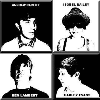
In terms of my print productions I used a stills digital camera to take the images that I used in nearly all of my panels. Whilst out on the shoots for the footage of the video, I also used a stills camera to take higher quality images to potentially use for my print productions. I stored these on my memory stick and was then once the music video had been completed, I had a large selection of images to choose from and could decide which would be most effective to use. I wanted to use the images which were most appealing and fitted best with the two-tone and ska/punk genres, so having chosen some of the raw images shown below,


I then imported them into a picture editing software called Adobe Photoshop. This was an elemental feature towards the editing of the raw images and because of the wide variety of tools and effects at my disposal, helped a great deal towards my creativity. We were able to choose the size of the blank canvas on which to begin editing (12cm x 12 cm for panels 1,2 and 3, 12 x 13 for panel 4, and A4 size for magazine advert) and then add various layers of images to this to create the desired look, as well as manipulating the image with various effects to enhance the image. One of the most prominent tools used by me was the magnetic lasso tool; this allowed me to cut out the faces of my acting band members from raw images, and impose them onto different backgrounds that were much more appropriate and fitting of the genre, for example taking the mid-shot of the lead singer from it’s original background and imposing her on top of the monopoly money background for my third panel, shown below. I also used the text tool extensively, with one example being to add the track names, publisher information and news board writing onto the fourth panel. I could then add a graffiti effect to the text to conform to the urban theme of the genre, to make it appear as though it had been sprayed on the wall. Without this package the raw images would not have been able to be finished to such quality and effectiveness.

All of these new technologies offer a vast opportunity to increase creativity. For example, in times prior to the emergence of Adobe Photoshop, media students would have had much less powerful editing software at their disposal, with far less possible effects to be used. Because of this huge array of effects to experiment with, new ideas are inspired during the editing process of print productions so consequently benefit your creativity. If I as a student only had the more primitive Microsoft Paint software to edit my magazine advert, I would not have discovered the spotlight tool as I did with Photoshop, and my final design would be lacking it’s main feature of spotlighting Izzy to establish her as the lead singer of the band in such an interesting way, so would have ended up being far less creative than when these new technologies are available.

In terms of my research, technologies were again of vital importance as without the ability to use the internet search engine ‘Google’ I would not have discovered such unsigned music websites as www.unsignedbandweb.com and would have not come across our own unsigned band, The Skanx. Via this unsigned band website we were able to come across the official website of our band www.theskanxband.co.uk on which we found our track ‘moneygrabber’, so Google was entirely important to finding the aforementioned websites that led us to our chosen track; without them finding it would not have been nearly as simple, if even possible.

Youtube was a key technology used throughout the process of research. In order to maximise the quality and effectiveness of my own productions, I had to research other similar media products from which to take inspiration and ideas, so when in the research stage of producing my music video, I used Youtube to search existing videos from other artists. By far the most influential band to my own work is Madness, and using Youtube I was able to view their video for One Step Beyond numerous times, and was also able to embed the video onto Blogger. This enabled my tutor to keep an ongoing watch on the progress on my research to keep me updated as to how to improve my analysis or other aspects of research, and was also a clear and easy to access way in which to present my research for future reference when planning. Upon viewing the One Step Beyond video which is a very typical example of the two-tone sub-genre, we took inspiration from it in the form of the ‘Madness Walk’, a type of movement performed by the band in the video that we later attempted on a shoot and eventually used to good effect in our own video, as it directly linked us to Madness and hence highlighted the genre we were trying to fulfil. Because of Youtube we were able to use this video as a direct intertextual reference. As well as using Youtube to view similar bands’ music videos, we also used it heavily to research both the film and tv series of This is England, which was by far our most influential non-musical existing media product. I again embedded clips and images from the film and tv series onto my blog as we took inspiration for our costume heavily from them. Dr Martens boots, braces and Fred Perry shirts are featured heavily in the music and print productions, and because of Youtube and being able to embed clips onto our blogs we were able to reference this fact as being the inspiration from which we took our own costume ideas. Without technologies such as Youtube and Blogger our group would have not been nearly as informed about costume that is fitting of the genre, and consequently our final video would not have been nearly as effective.

I used a less conventional method of researching existing products when in the stage of researching for print productions. Before beginning the editing of my digipak, I used Apple’s music software iTunes on my own computer to scan through the different album covers of various artists in my own music library to gain inspiration for my own album cover. I already had a rough idea of what I was looking for, but the ‘coverflow’ feature on my iPod allowed me to quickly scan through hundreds of existing album arts in order to back up my vague initial ideas. Doing this, I came across the front cover of Blur’s ‘Best of Blur’ album and saw it to be an effective method of establishing the band whilst being typical of the band’s pop rock genre in it’s pop-art style and colour scheme, so embedded the image onto my blog and commented on it’s effectiveness in a previous post regarding print productions. I eventually ended up using an extremely similar idea in my own digipak (panel 2) though changing the pop-rock connotations from the Blur album to one’s fitting of the ska genre (by changing the threshold of the image on Photoshop to make the image black and white

– typical of two-tone ska), so because of iTunes I was able to discover an effective existing album art and use it as a strong reference for my own productions.

Final Evaluation: Q3 - What have you learned from your audience feedback?

The way in which we conducted our audience research was via the utilisation of hard-copy questionnaires. We gathered a mixed gender class of existing AS media students (of ages 16-17) and sat them down to view our music video on a large screen projector as if they were to be watching it on a music television channel to give an authentic experience. It was a small class of around eight students, and in order to save time we split the class into two groups; four of whom viewed our video, and another four who viewed another student’s A2 video in another room, so consequently gained four relatively detailed sets of data at the end of the viewing. We let the group view our video once for leisurely viewing, and then played it to them for a second time having given them a paper questionnaire regarding different aspects of our production. The first half of questionnaire worked on a scoring basis of 1-5 (5 being highest) regarding the rating the viewer would give our production when asked questions about their enjoyment of the video, quality of camera work and editing, and quantity of conceptual features etc. It then goes on to ask about any improvements that could be made, or any aspects that were found offensive. An example of one of the completed questionnaires we gathered is shown below. We then gave the four AS students the completed copies of our print productions to look through. With our music video fresh in their minds, we presented them with another set of questionnaires regarding our print productions in a very similar format to our music video ones, asking questions about the coherence and effectiveness of our digipaks and magazine adverts.

The first question posed to the participants of the questionnaire was ‘How much did you enjoy the music video?’ From the responses we received the average score we gained for this was 4.25 out of 5. I was happy to receive such as positive score as one of the main aims we had gone out to achieve when producing the video was to make it fun and interesting to watch in order to keep the audience interested and conform to the fun nature of the ska genre. This result indicates that we were relatively successful in creating a fun and interesting video. The next question asked about the video’s success in holding the viewers’ attentions, giving an average score of 4.5. From looking at other questions, I have come to the conclusion that our video’s ability to hold the viewers’ attentions can be attributed to it’s inclusion of familiar local area and bright colours, as these were two of the most prominent responses from participants when asked about their favourite part of the production. Because we filmed the majority of the video in areas of the city centre where our audience are likely to have visited on numerous occasions in their day to day life, this stands out to them as they can relate to mise-en-scene. This can be linked to the findings of media researchers Bulmer and Katz, who had expanded on Lasswell’s Uses and Gratifications Theory (1948) and suggested that one reason for audiences viewing a particular production can be attributed to their need for personal relationships; using media for emotional and other interaction. In the case of our video, because the viewers had recognised the locations in our mise-en-scene they felt the need to continue viewing as they could relate to the video, possibly as they have had personal experiences or emotional interactions with the locations in our video (e.g. the place where they spent many days of their last summer), hence holding the audience’s attention. The fact that we also increased the saturation of a number of shots made them visually more appealing. Before this manipulation of the footage at the editing stage, the shots of the acting band in front of the graffiti background was disappointingly dull and was not in-keeping with the lively tone of the song or extravagant nature of the genre. This idea that the increased saturation of some shots causing an increased appeal to the audience could also explain the relatively high average score of 4.0 received for the quality of editing and 4.25 for quality of mise-en-scene, as the audience have clearly found our colourful settings to be appealing. This is further backed up by the fact that one participant added the comment that their favourite aspect of the video was the colourful mise-en-scene, stating that “it’s fun”. I was particularly pleased to have received this comment as our aim from the beginning was to make the video fun and quirky via the use of conventionally ska extravagance and bold colour – this comment has directly proved that we were a success in this area. I have established that there were no negative issues regarding the representation of race, age, culture or gender etc as every response to the question was a “no”; same with the question as to whether the plot was difficult to understand, which I feel is duly to the fact our film was a concept-based montage rather than having a narrative structure. It was also unanimously agreed that if given the opportunity, participants would watch the video again, the video successfully represented the style of music, and successfully promoted our band, The Skanx.


Use of colourful urban background.

Near identical questionnaires were given to the same participants after viewing my print productions. I have established that I was fully successful in both creating a high standard of graphics within the productions, and establishing the Britishness of the package, as these both gained average scores of 5 (following the same scoring scheme of 1-5 out of 5 from the video questionnaire). I feel that this was achieved through my extensive use of the Adobe Photoshop computer editing programme. Having taken the initial raw images used within my digipak, I then spent many hours manipulating and tweaking the images to make them more visually appealing; in particular my fourth (back) panel, where I had taken a plain image of a news board and added multiple effects to make the image more interesting and graphically interesting, which when looking at the responses given from the questionnaire, was effective in doing so. The Britishness of the package was achieved primarily through the use of costume. Throughout the construction of both the video and digipak we have strongly referenced British bands such as Madness the film ‘This is England’ to name just a couple, through the application of our costume. The use of braces, boots and trilbies etc has been highly successful in referencing these existing bands and media texts throughout all of the panels in my print productions as well as in the magazine advert. The package overall gained again a rating of 5 which indicates it’s success in appealing to my youthful target audience, and all participants stated that the magazine advert would encourage them towards purchasing the digipak were it to be available. There was one small difference between two of the questionnaires, as one participant is quoted as having said that the strongest feature of the print productions is “the establishment of the genre of the music” which would indicate that I was successful in promoting the fact that our band are of the ska genre, however another only gave a slightly disappointing score of 3 for the question ‘does the magazine advert successfully represent the genre of music?’ This differing opinion can be linked to the Reception Theory and Stuart Hall’s encoding/decoding model of the relationship between text and audience. For example in my own production, although one of the main themes throughout the digipak has been the use of bold extravagant colours to connote the fun nature of the ska genre, for the second panel of the digipak I have used a black on white effect to represent the two-tone roots of the soundtrack and band, very different from the bold colour used overall. As the producer the use of this black on white effect is an example of how I have encoded the text to connote the two-tone aspects of the soundtrack, however this particular participant of my questionnaire has shown an example of aberrant reading, where there is a disagreement between the intentions of the text and the interpretation by the audience due to the way this black on white effect has been decoded by the reader, showing two different readings of the same code.

The example of aberrant reading previously mentioned has come about because of two different types of decoding by a male and female reader. The male participant of the questionnaire had decided that the way in which I had established the genre within my digipak was the strongest feature about my production, whereas the female participant disagreed and by the mediocre scoring of a 3 indicated that it was one of the weaker aspects. This is the only example of differing opinions of male and female responses and highlights that gender can influence the way in which a text is decoded when initially being given the same production to look at, and therefore the same code. Despite this difference in opinion over the matter of genre representation, all of the male and female ‘further comments’ indicated that my print productions were of a high standard, having been quoted as being “really good!” so I am overall pleased with the audience reaction to my productions.

We uploaded our final video onto Youtube where it has so far received a total number of 141 views. We later received a comment on the video from one of the members of the band whose soundtrack we had used, The Skanx, praising our efforts on the video and invited us to come to London to film them live to produce more videos – “On behalf of The Skanx - nice video! Come see us soon... Maybe you can do a full length take with some live footage.” This comment is a further indication of the successful appeal of our video and was an important contribution towards our motivation to complete the rest of the project to as high a standard as possible in order to comply to their levels of requirement, and is an offer that we as a group are currently contemplating as would be a fantastic opportunity to produce further videos with the genuine band members, which could potentially be used as their official music video.


Final Evaluation: Q2 - How effective is the combination of your main product with ancillary texts?

Having completed my music video, I then aimed to create my print productions with the generic aspects of my video in mind. It is of vital importance that there is an extent of continuity from the video when producing the print productions, as it needs to be made clear that one is directly linked to the other as to form a distinct and recognizable brand style; in our case Two-Tone Ska and Ska/Punk.

One way in which I established a link between all three productions was by using screen shots from my initial video footage to use in the panels of my digipak. In the music video the performers’ costumes are generic whilst they for example, performed the ‘Madness Walk’ and ‘skanked’ around various areas of the city to be used in our concept-based montage. In this footage the performers’ costumes are Dr Martens boots, braces and Fred Perry shirts (and Jack in his suite and trilby). I took a print screen of our video and saved it as a Jpeg file and then opened it with Adobe Photoshop to edit the original picture (using such effects as increased saturation and the text tool) to be used as the front panel for my digipak. I used this as I felt it to be wholly effective in both establishing the band members and the genre, as well as being a direct link to the music video itself. This enables potential fans to recognize the band’s motif, such as stated by Goodwin about bands establishing and then featuring their motifs in order for videos to be successful. The panel is colourful and eye-catching, and is instantly recognizable. This is one way in which my print productions are strongly linked to the music video. These two images show the initial image we took whilst on our initial shoot, and the completed digipak front panel, showing the progression from raw image to completed production through increased saturation, cropping, use of text tool and border. These changes have been effective in making the image more appealing to the audience by making it more eye-catching through the increased saturation, and more relevant to the two-tone aspect of ska by the use of the border, whilst continuing the reinforcement of the genre.


This idea of my target audience feeling a sense of familiarity can be heavily linked to Goodwin’s theory of recurring motifs. When an artist begins to create a brand style for themselves, a particular image that they either intentionally attempt to, or unintentionally achieve which is then more widely recognised and then associated with that artist. For example, throughout our music video, our actors are dressed in typical ska costume. This same costume is then used in our image on the front panel of my digipak with the aim of creating continuity. Because this same costume features so prominently, the audience begin to associate this type of costume with our band.

Gunther Kress, whose theory about genre is explained in more detail in the previous question. I have used a chequered border around the front panel of my digipak, as it is a generic convention of the two-tone ska genre. Because this will be instantly familiar with audiences whose preferences include this sub-genre, they will conform in the product with the aim of feeling a sense of inclusion in the two-tone ska following. This is my reasoning behind including the border on my front panel, and emphasises the coherence of my digipak.

The inspiration for my second panel was taken from the artwork of Blur’s album ‘The Best of Blur’ and I felt it a simple yet effective way of establishing the band members. I have taken a shot of each of the four acting members of the band and arranged them into quartered sections of the panel, much like with Blur’s album. I have then edited the ‘threshold’ of the image to make the actors’ faces appear black or white upon the contrasting background, as shown below. My reasoning for doing this can again be linked to Kress’ theory of genre and that audiences consume the media products intertextually. Because my target audience are highly likely to be fans of the two-tone sub genre, this photoshopping technique is likely to be appealing to them as contrasting black and white in very simple patterns connotes two-tone imagery. When fans see this design, connotations of two-tone will be instantly instigated and will be drawn towards it due to a will for social inclusion, linking to tribal identity. I also chose to make the actors look at each other across the various sections to add an element of humour. Although this is a different approach to that of the ska/punk element of our productions, our band is predominantly two-tone so this use of black on white is wholly appropriate whilst also intertextually referencing the slapstick comedy of such black and white films as those by Charlie Chaplin and Laurel and Hardy.


My third panel is a play on the whole idea of the protagonist of our video being seen as a money-grabber. A recurring image throughout our video is the use of monopoly money. This is to reference the economy at both the current time, and the era during which ska music was at it’s peak (80’s), and highlight the attitude towards it given by the ska/punk fans of that era (such as the characters from ‘This is England ’86’). I have centered the lead singer amongst a backdrop of monopoly money, on which I have used an effect to make it look as though it is spinning. This gives connotations of the money grabbing woman being in control as the image of her is steady and crisp, whereas in contrast her surroundings are a blurry motion to connote chaos. It is to present an ironic statement about capitalism. The bright colours are in-keeping with the comic element of ska music which has become generic of the genre since it’s popularity has grown. A similar theme to this has been used in the creation of my advertisement, which has used the same image to present the same idea about the money-grabbing female protagonist. This emphasises the continuity between my productions because of the visual link between them, and has helped towards creating a coherent promotional package which has an intentionally created brand style (being that of the multiple uses of monopoly money, presentation of the female protagonist, costume and uses of both bright saturated colours also with elements of black on white etc).


My final panel of the digipak is in-keeping with the urban style of the ska genre as it is an image that I have taken outside of a local shop, and have manipulated to insert track names from the E.P. to appear as graffiti on the wall. It is also keeping the continuity from the other products in the sense that it is heavily focused around the country’s financial situation, be that both from the era when ska was at it’s peak popularity, and the contemporary situation. The use of a news board, featuring a headline regarding ‘bankers’, is intended to promote the financial background of my productions by having a ‘dig’ at the bankers who instigated the financial crash in 2008. Throughout our music video the actors are shown in urban locations, and mixed in with the concept-based montage of monopoly money, relates heavily to this final back panel of my print productions, via both the urban and financial topics. Like in each of the other panels, and music video, I have manipulated the original image with effects to increase both the saturation and contrast to make it appear more bold and thus developed the ironic zany style.


Final Evaluation: Q1 - In what ways does your media product use, develop or challenge forms and conventions of real media products?

Our music video is very much typical of the ska genre and the aspects of it that we aimed to achieve, however overall greatly challenges conventions of the role of women within society. The most prominent media text used within all of the research, planning and shooting of our production is Shane Meadows’ ‘This is England’. This is greatly emphasised through the costume of the cast in our video. We have taken ideas for the costume of our cast predominantly from TIE (This is England). We have used Dr Martens boots, Fred Perry shirts, trilby hats, black slim fit suits and braces, all of which are iconic of the genre and feature in TIE. For example, these are the braces worn by me when acting as a band member in the video, and also there is a shot of Shaun, the protagonist from both TIE and TIE ’86 (the follow-up TV series) from which we got our costume inspiration. Although we had previously established that our song is more fitting of the two-tone ska sub-genre, we still felt it highly appropriate to cross reference texts of the more ska/punk sub-genre such as TIE when regarding aspects such as costume in our video. There are also large amounts two-tone elements within it such as the suit worn by Jack (actor), trilbies, and badges and glasses worn by both Jack and Izzy (actress), which are far more conventional of this sub-genre.

Another way in which we utilised aspects from similar texts of the ska genre is in the variety of shots we used. Our opening shot is of Izzy playing the protagonist female ‘money grabber’ and lead singer of the band, where we used an over-shoulder shot of her getting ready in the mirror. This inspiration was taken from a similar shot from TIE. There is also a brief shot of the same type later on in the video where Harley (actor playing band’s drummer) is seen getting ready in the mirror in the same fashion as it can be used to reference the existing text of TIE again. In the case of the shots regarding Izzy, she is shown putting on lipstick which emphasises her role within the video as being very much typical of the social expectations of women, making herself look glamorous and hence developing the conventions of the way in which women are presented in the majority of existing music videos; glamorously. This can be linked to Goodwin’s theory in the sense that generally, and in our own case, successful videos include lots of close-ups of the artist in order to establish them as having a dominant role within the band, as well as developing a recurring motif that features prominently throughout their work (e.g. the braces and lipstick worn by Izzy). This is also in-keeping with the theme of the song – ‘Moneygrabber’ in which it suggests that the female character is a glamorous figure who manipulates men to get her hands on their money. Our video reinforces the notion that “diamonds are a girl’s best friend”, which could be read as a negative representation of the female gender, or In contrast could be a playful representation of the stereotyped manipulative female.

We also heavily referenced other bands of the genre within our video to make the production more fitting of the genre, and to make it more appealing to our target audience. The band we focused most prominently on are ‘Madness’. Madness are a British pop/ska band from Camden Town in London, who formed in 1976. They were the pioneers of a particular style of dance/walk called the Madness Walk (shown in this picture). For our own production to become more appealing to our band’s target audience, and as Madness are a band so heavily linked with our own to use as an intertextual reference, we attempted to recreate this style of walking, which is typical of Madness’ fun and quirky approach to ska. In terms of sub-genres, Madness were very much of the two-tone wave and were typically seen performing in smart black and white suits and Suggs’ (lead singer) iconic aviator-style glasses. The fact that we have dressed our actor Jack in a similar style works well towards recreating their image and emphasises how influential a band they were to the planning and production of our video. This is an example of how we have utilised aspects of real media products in our own production.

The reason behind us having referenced Madness so strongly throughout our video can be linked to the media theorist, Gunther Kress. In 1988 he defined a genre as being ‘a kind of text that derives it’s form from the structure of a frequently repeated social occasion, with it’s characteristic participants and their purposes’. This basically means that when watching certain media productions that have elements of similarity to other texts they are familiar with, audiences feel a sense of belonging to a specific group. For example in our own video, when we dress our actors in costume typical of the ska genre, and they view the actors performing the ‘Madness Walk’, they recognise these as having been in similar media productions so feel a sense of familiarity and comfort, so feel a part of the ska social grouping. Therefore our music video has the aim of making the audience feel a sense of collective audience identity.

Again looking at media theorists, Andrew Goodwin also played a large role in the planning of our own production. Goodwin’s theory states that successful music videos must demonstrate genre characteristics. Our own video evidently does this in terms of costume and shot types etc. as explained in previous paragraphs of the question. Because our band are of the ska genre, our video is not likely to feature a dance routine as would be used by a girl or boy band such as ‘Boyzone’, as it would be completely ill-fitting of the genre and would not appeal to our target audience. Instead we have made a quirky montage of both performance and concept-based images that is far more typical of the genre. He also stated that there should be a relationship between lyrics and visuals in the video. This is greatly appropriate to our own production as when the lyrics are referencing the ‘money-grabbing woman’ we ensured that Izzy is on screen playing the part of the money-grabber, or shots of money are in focus as this is strongly appropriate to the lyrics. The use of close-up shots of Izzy applying the lipstick can be linked to voyeurism, with voyeuristic treatment of the female body being an important aspect in Goodwin’s theory.

Our band, The Skanx, fit mainly into the 'two tone' context of ska, which was initially created in the UK the 1970's and uses elements of ska, ska punk and reggae dub to fuse together a brand new sub genre. Out of the similar artists I have researched in the planning of our video, The Specials and Madness are the bands that fit most into the two tone ska sub genre, so i can safely say that The Skanx are most closely related to The Specials and Madness in terms of genre, rather than say [Spunge] who are of the later ska revival genre of the 90's called 'third wave ska', being a different scene to the two tone ska scene. This two tone ska association is backed up by some of the art used in their videos, which black and white simple checked design is heavily linked with the two tone ska scene, for example this band logo. Our target audience are likely to be equally as youthful as the type of audience who were fans of such bands as Madness at the time of their peak popularity in the 1980’s (e.g. 16-20’s). We aim to appeal more so to the male half of the audience, having portrayed the main character in our video as a glamorous, money-grabbing woman, as this may not be as appreciated by a female audience as well as the fact that three out of our four band members are male. In conclusion, our target audience are likely to be mostly males of a sixteen to early twenties year age, much like the audience of our most prominently focused-on similar band, Madness at their time of peak popularity.

In the same way as our music video, my print productions also use and develop conventions of real media products. My first panel is a shot of the acting band in a pose when imitating the madness walk, aforementioned. One way in which this panel uses conventions of the ska genre is by the use of bold, vibrant colours which connote the fun nature of the ska genre whilst being featured in the urban mise-en-scene that is iconic of the genre and it’s fans. My second panel was taken from my initial research into the album cover for Blur’s ‘Best of Blur’ where I have used an image of all four acting band members arranged into quarters of the page in the style of Blur’s iconic album. However I have manipulated the image in such a way to conform to the conventions of the two-tone sub genre by changing the threshold of the image to make it appear black and white – this simple black and white of course being so iconic of two-tone, as discussed in the previous paragraph. My third panel uses a focussed image of Izzy being established as the protagonist amongst a blurred background of monopoly money, which is intended to represent the idea that she as the money-grabbing woman is focussed (whilst being literally ‘in focus’ on camera) and in control of the male gender, and chaos of the current and past economy that is represented by the blurred monopoly money. My final panel also conforms to the conventions of the ska genre by showing a news board, which can be linked to all the current news about the banking catastrophe that has been in all the tabloids, whilst being set against a brick wall background, which represents the urban theme of the ska genre.

Final Evaluation: Project Brief

A promotional package for the release of an album for an unsigned British band or artist to include the following:

- Music promotional video

- Cover for it's release as part of a digipak

- Magazine advertisement for the digipak